From our earliest concepts to the bottles we craft today, every design reflects our commitment to wellness, quality, and continuous improvement.
Before there were labels, there were the drops - our very first posters. Juice poured into a simple glass or mug, a bold flavor name, and a single promise: Start fresh. Stay fresh. This is where Freshstart found its voice.
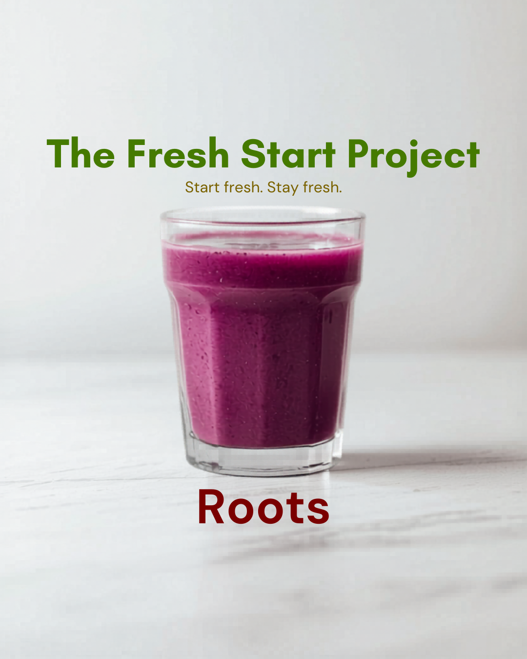 Roots · Drop 1
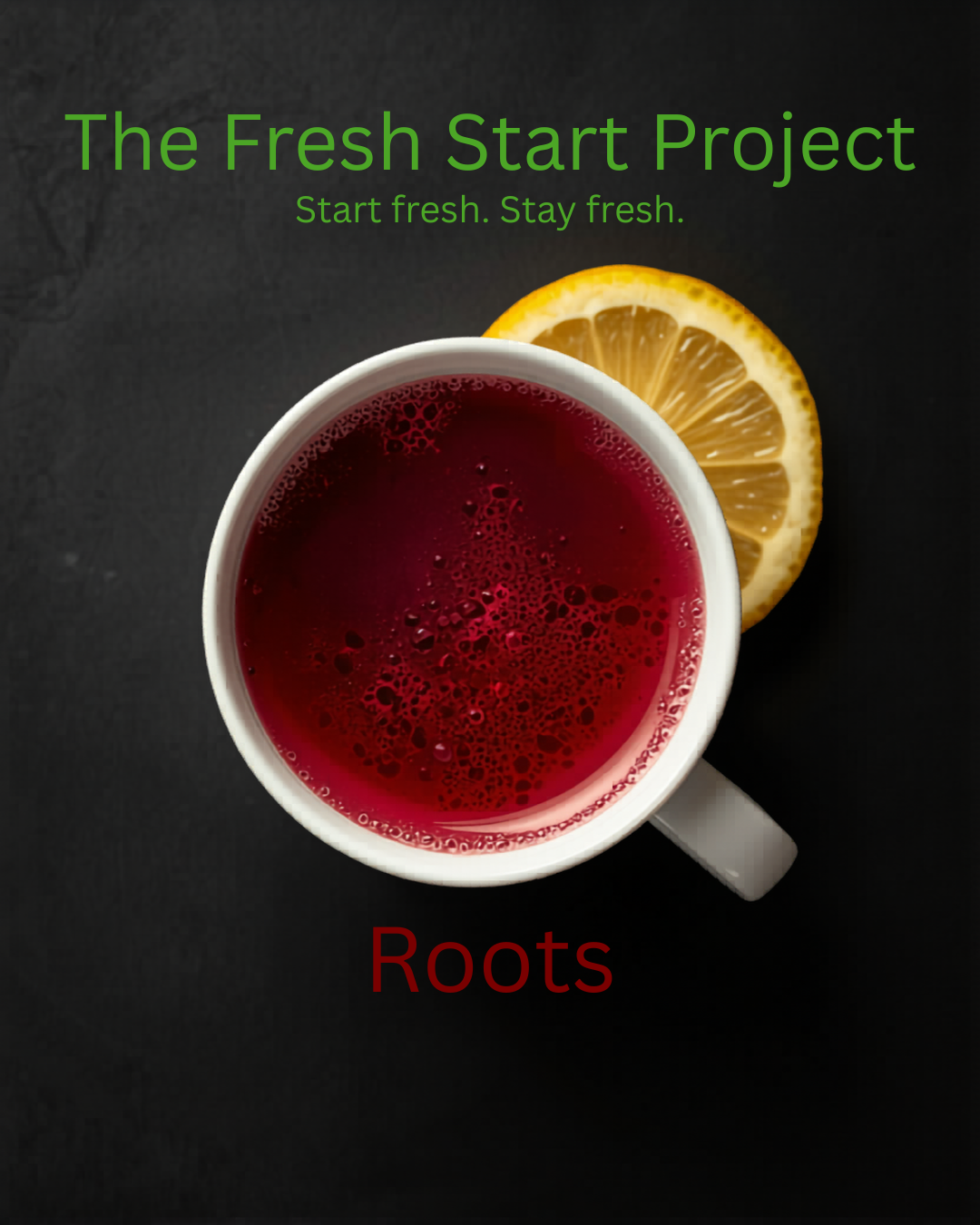 Roots · Dark
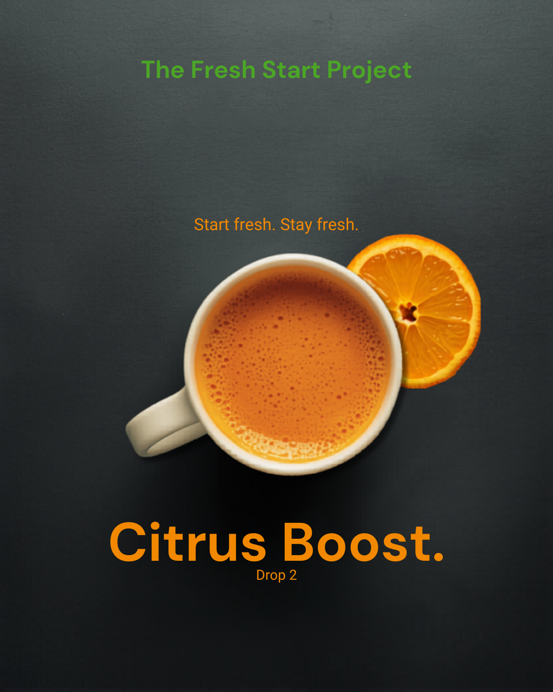 Citrus Boost · Drop 2
And before the poster, the prep - whole produce weighed out by hand on the countertop, exactly the way every batch still begins.
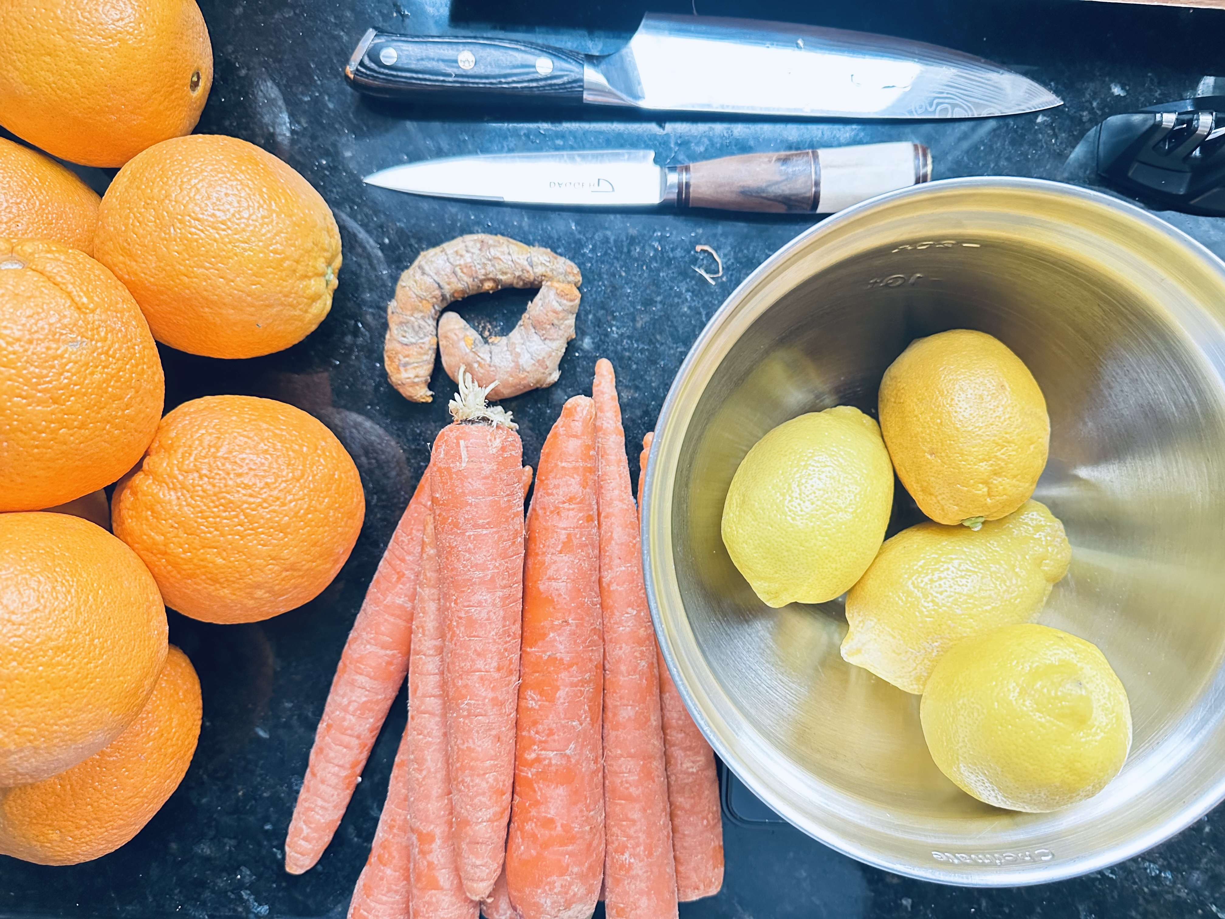 Roots · Prep
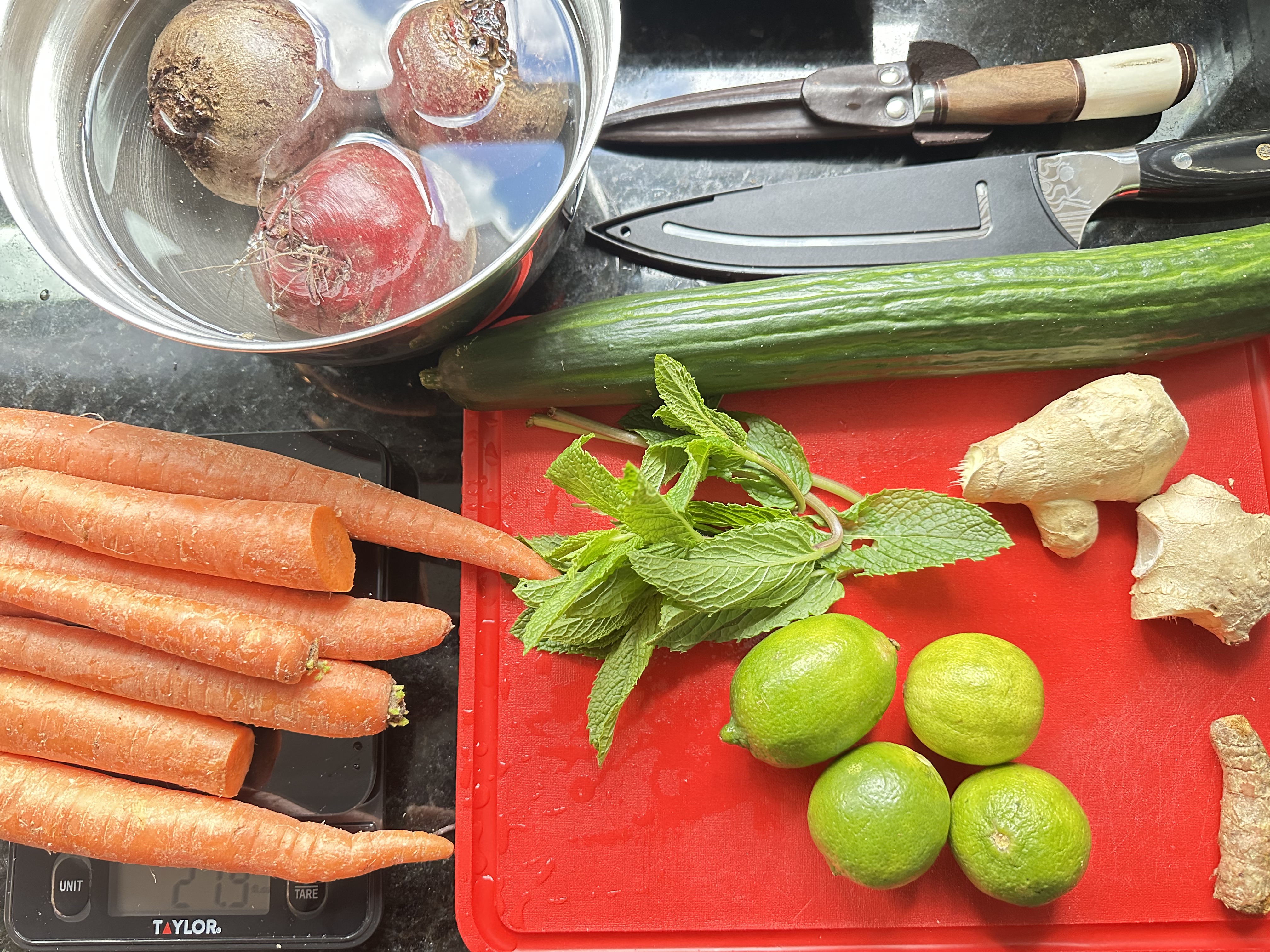 Citrus · Prep
Our first true packaging: a solid color block anchoring the bottle, the freshstart wordmark in white and green, and each flavor named in a confident italic script. Loud, proud, and impossible to miss on a shelf.
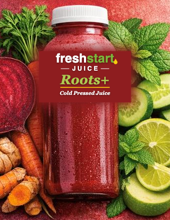 Roots+
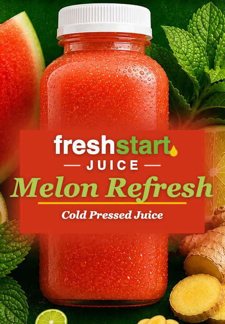 Melon Refresh
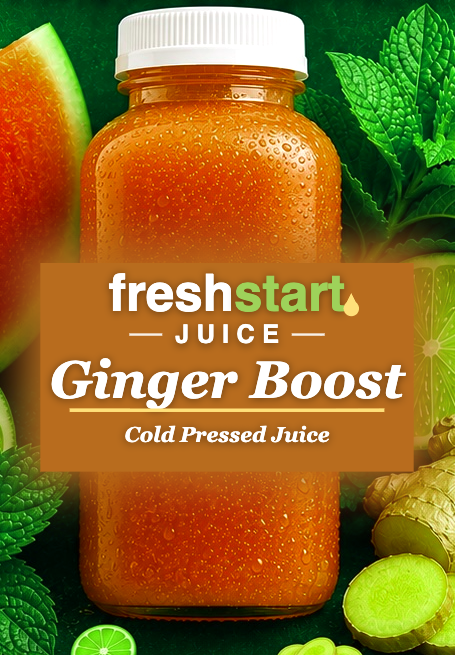 Ginger Boost
We pulled back the color block so the real juice could shine. The label went translucent - reading as if printed straight onto the glass - with cleaner type and more room to breathe. The same character, quietly grown up.
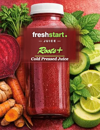 Roots+
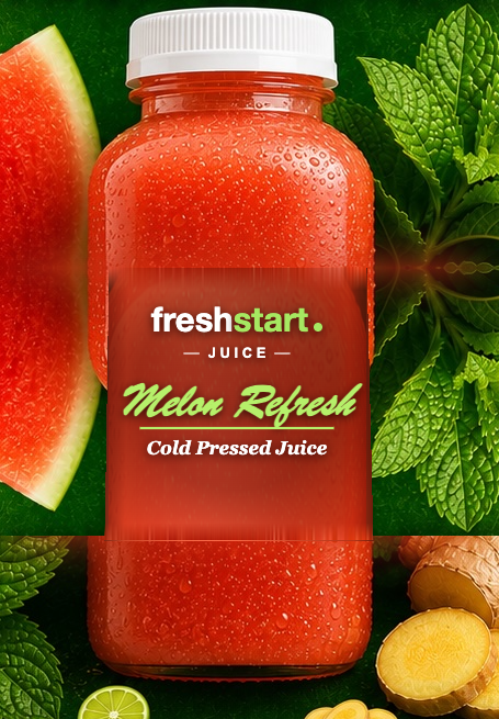 Melon Refresh
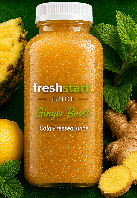 Ginger Boost
Today's bottles pair rich, true-to-ingredient photography with a refined wordmark and flavor script - plus the occasional illustrated poster for the fun of it. Polished, but still unmistakably us.
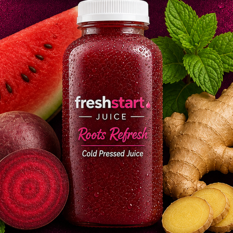 Roots Refresh
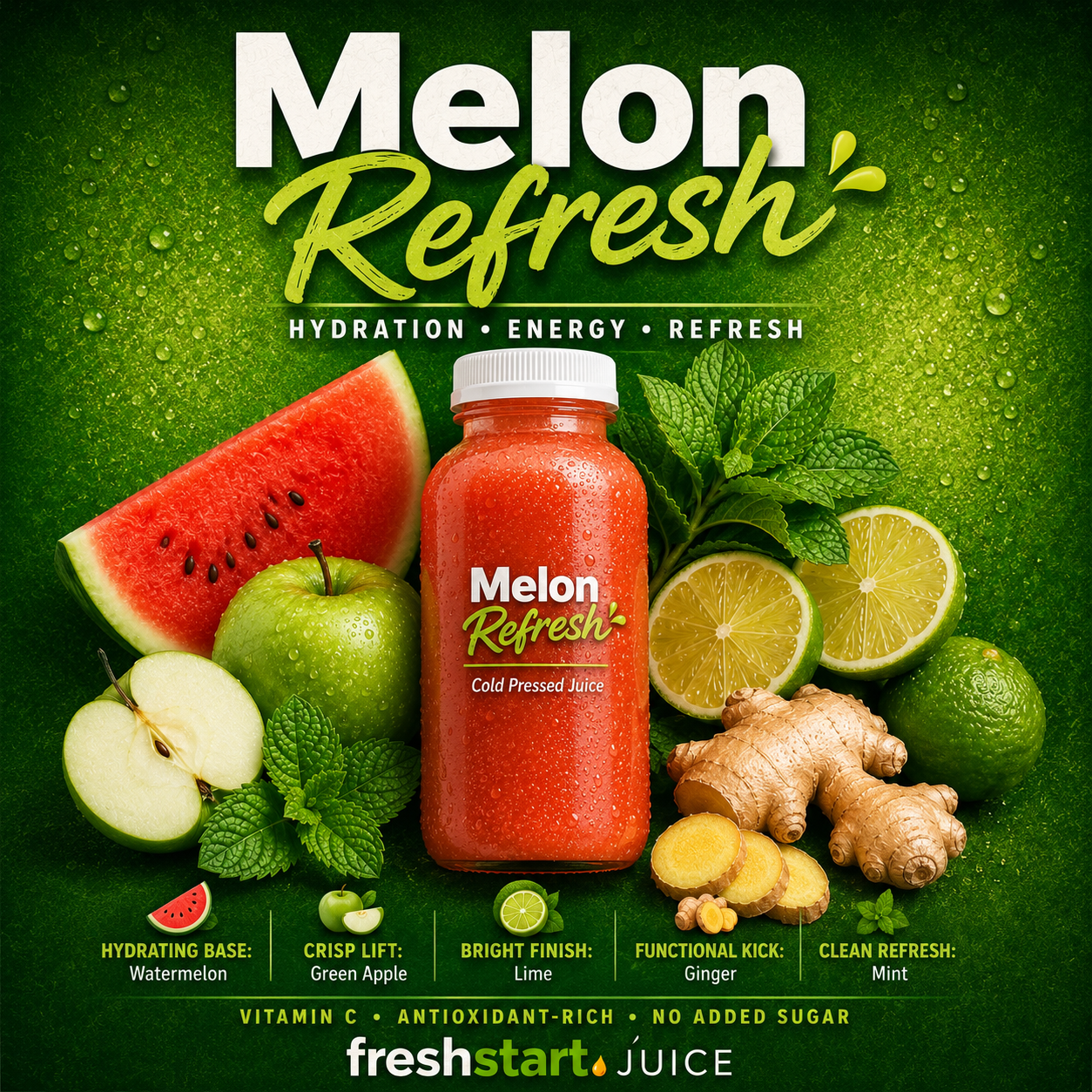 Melon Refresh · Poster
With the label locked, we brought the bottles into the studio. Clean, minimal packaging photographed in natural light - a full six-pack lineup, sun-dappled and shelf-ready. This is the look that carries Freshstart today.
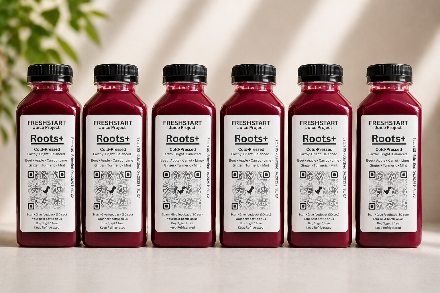 Roots+ · Six-Pack Studio Shot
Beyond the bottle, each flavor earned its own campaign poster - saturated color, fresh-picked ingredients, and a flavor script that gives every blend its own personality. Roots Refresh in deep magenta, Ginger Boost and Melon Refresh in vivid green.
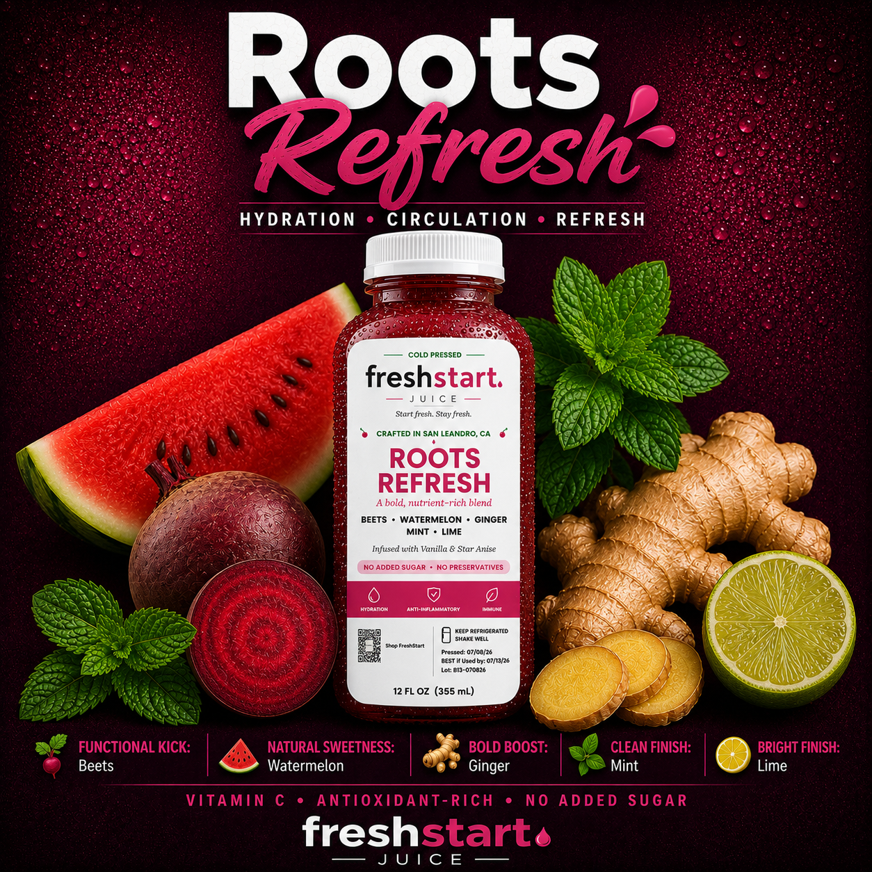 Roots Refresh
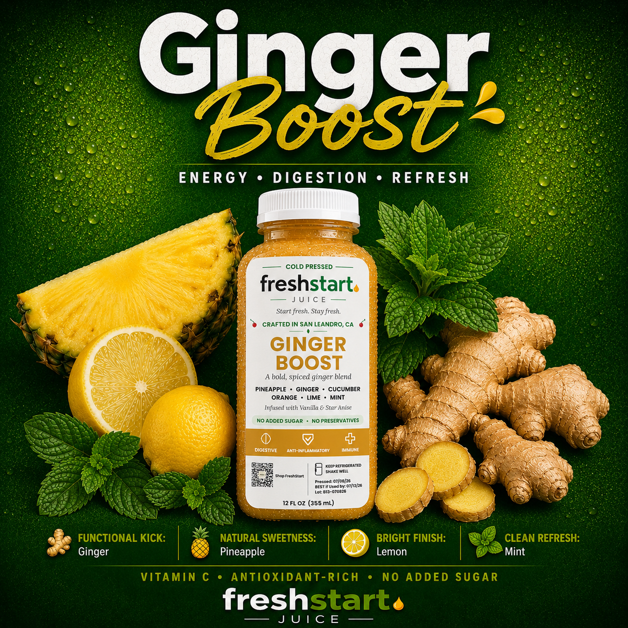 Ginger Boost
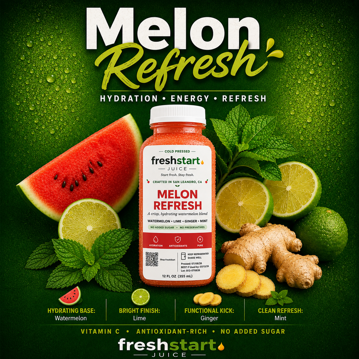 Melon Refresh
The newest era isn't just packaging - it's storytelling. Social-ready compositions and ingredient anatomy diagrams break down exactly what goes into every bottle and why, turning the label into an education. Tap any image to view it full-size.
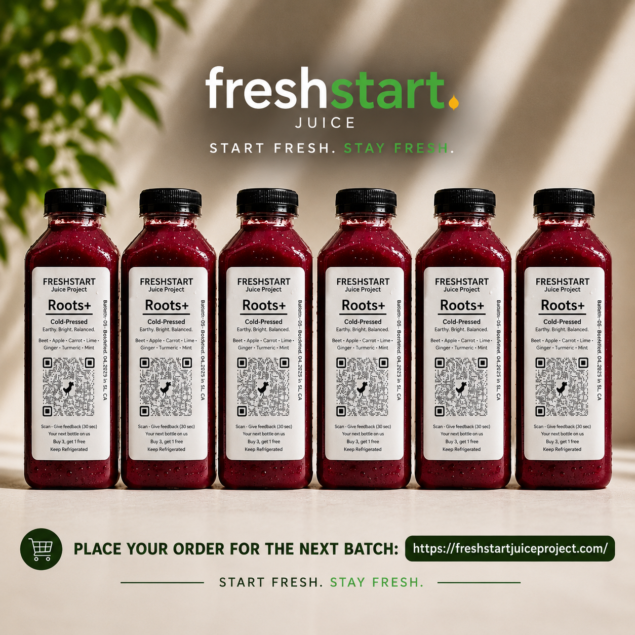 Roots+ · Social
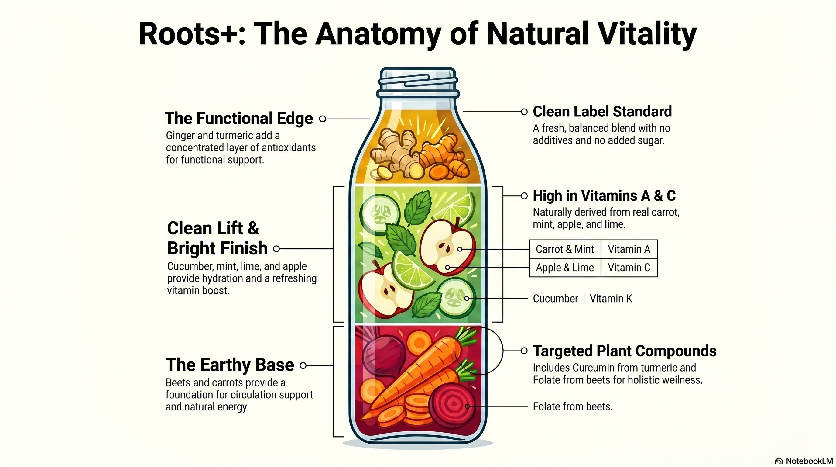 Roots+ · Anatomy of Natural Vitality
Two new blends joined the lineup, bringing the signature collection to six. Citrus Glow and Pure Celery, cold-pressed and ready to shop.
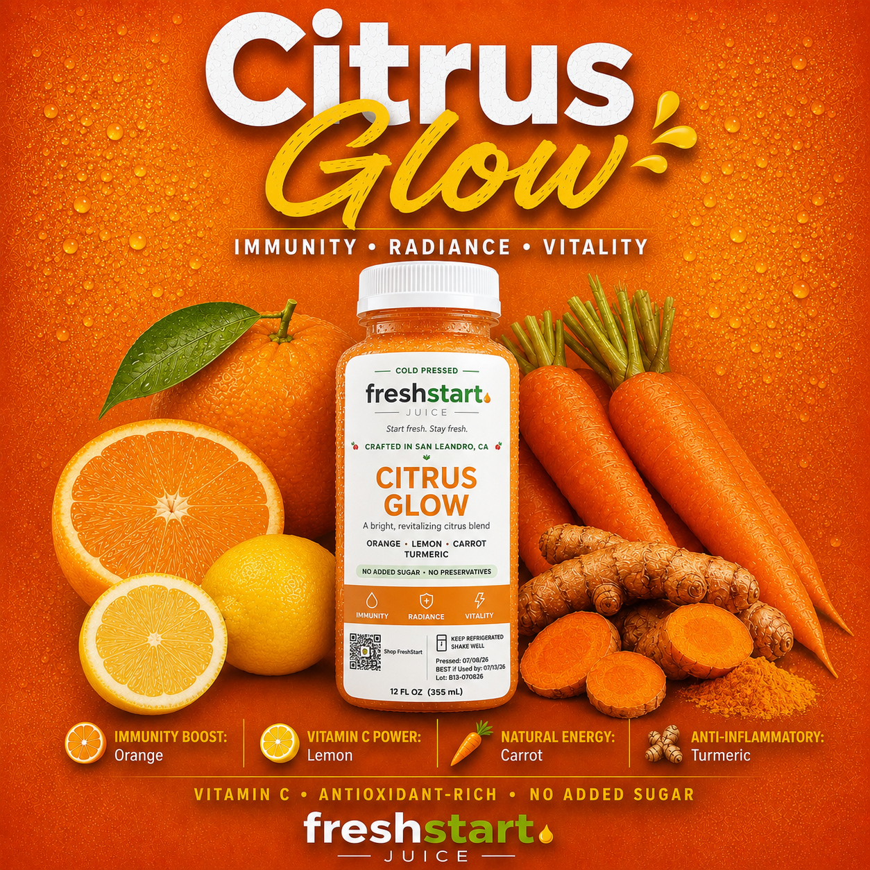 Citrus Glow
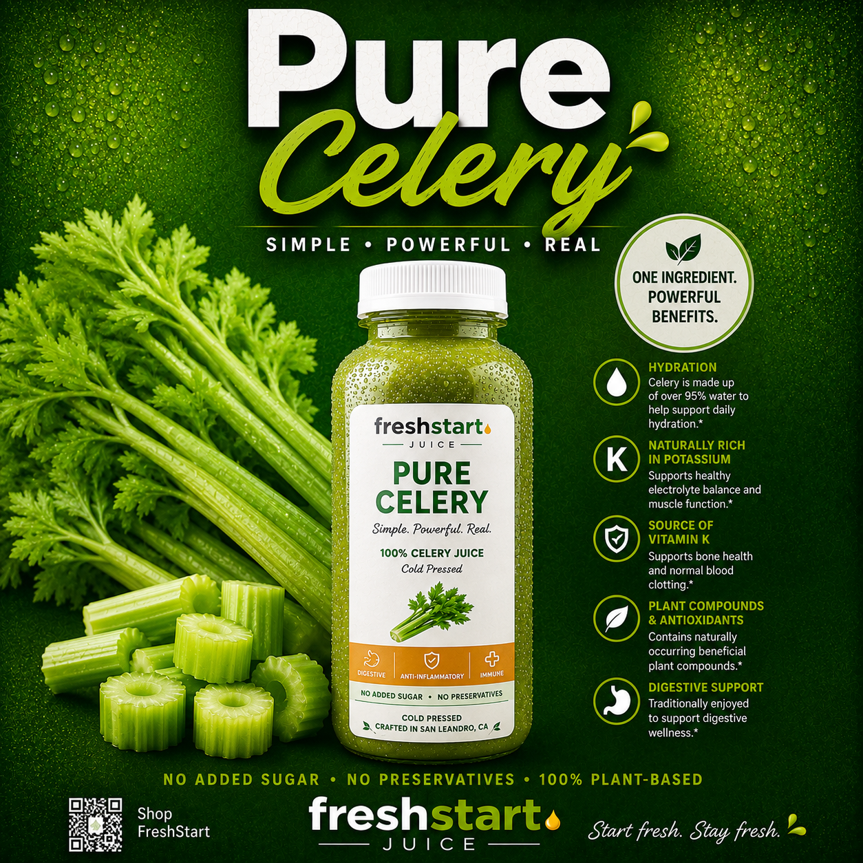 Pure Celery
The Wellness Pack, Family Pack, and 3-Day Reset turned our six flavors into structured programs - a curated lineup for every day, not just a single bottle. This chapter exists because founding member DB Bedford planted the seed for it.
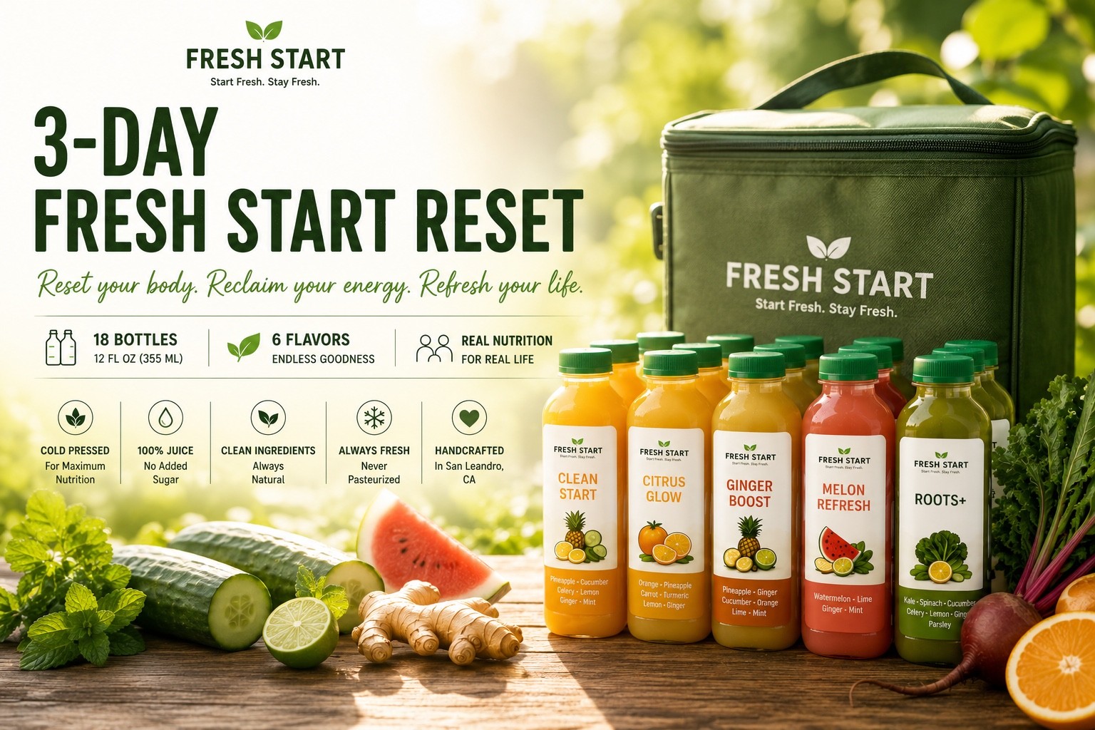 3-Day Freshstart Reset
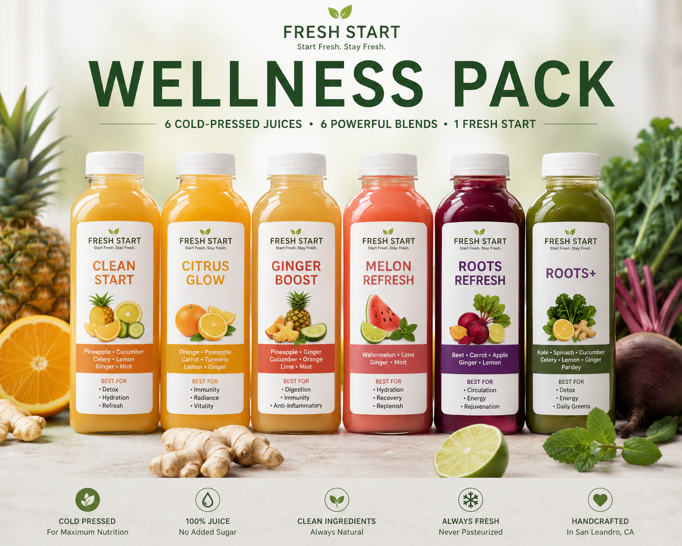 Wellness Pack
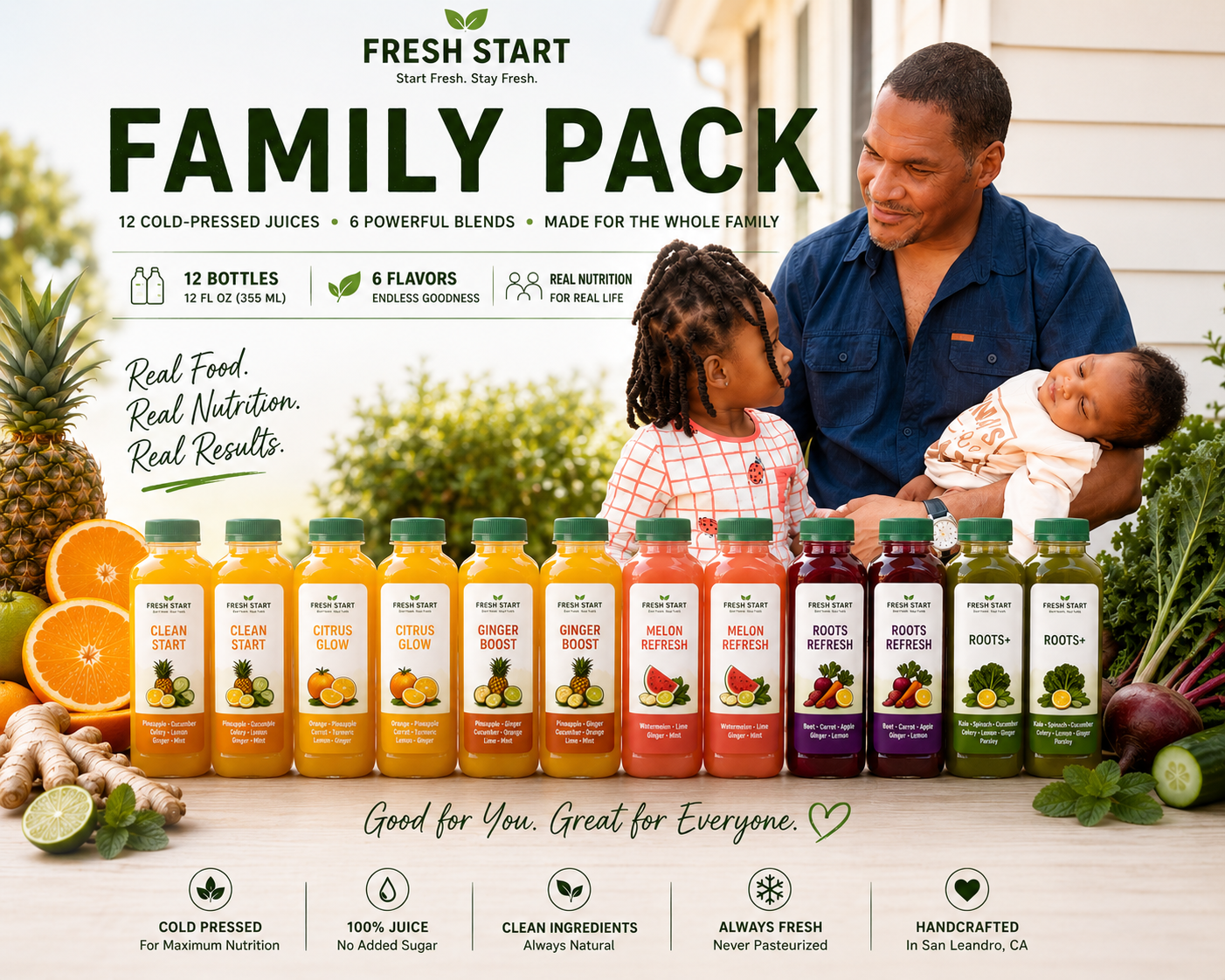 Family Pack
Our first botanical tea joined the lineup, bringing the signature collection to seven. Brewed from pineapple, orange, and lime peels for a naturally bright, caffeine-free refresh - a tasty way to put fruit peels to good use instead of the compost bin.
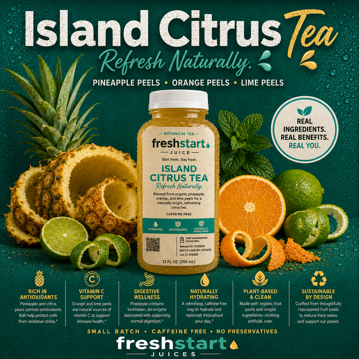 Island Citrus Tea
Seven cold-pressed blends, handcrafted in small batches. Build your pack and see today's labels in person.
Build Your Pack